


How to Manage Cron Jobs with TYPO3 Scheduler (Complete 2026 Guide)
Development
Make your TYPO3 site modern- In this article, you will find 10+ possible ways to create responsive images using TYPO3 core and TYPO3 extensions.
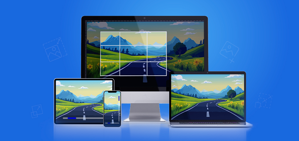
Responsive images help deliver fast, optimized TYPO3 websites across desktop, tablet, and mobile devices. TYPO3 provides multiple ways to implement responsive images using core features, Fluid ViewHelpers, TypoScript, and extensions.
In this guide, we explore 10+ ways to create responsive images in TYPO3, using techniques like srcset, <picture> tags, and lazy loading to serve images that adapt to different screen sizes.
Responsive images:
TYPO3 handles images through its File Abstraction Layer (FAL), supporting backend cropping, automatic image processing, and rendering with <f:image> and <f:media>, while allowing further customization via TypoScript and extensions.
TYPO3 includes strong built-in image handling, but some projects require more control over how images are generated, optimized, and delivered across devices.
srcset or <picture> setupsCustom implementations are useful when projects require:
TYPO3 supports several approaches depending on the level of customization required.
| Method Type | Best For | Key Features | Complexity |
| Core TYPO3 Methods | Standard websites | Uses <f:image> / <f:media>, cropping, lazy loading | Low |
| TypoScript-Based Methods | Integrator customization | Configure srcset, sizes, breakpoints | Medium |
| Extension-Based Methods | Advanced setups | Extensions like vhs or sms_responsive_images | Medium |
Custom PHP Processing | Complex projects | Custom ImageProcessors and full rendering control | High |
This overview helps developers and integrators quickly choose the most suitable responsive image approach for TYPO3 projects.
TYPO3 provides multiple approaches to implement responsive images depending on your project requirements. From core Fluid ViewHelpers and TypoScript configurations to third-party extensions and custom PHP processing, developers and integrators can choose the method that best fits their workflow and performance goals.
In the following sections, we explore 12 practical ways to create responsive images in TYPO3 projects.
<f:media>One of the simplest ways to render images in TYPO3 is by using the core Fluid ViewHelper <f:media>. It automatically handles image rendering through TYPO3’s File Abstraction Layer (FAL) and supports common attributes such as width, height, alt text, and lazy loading.
This method is widely used in TYPO3 templates and works seamlessly with EXT:fluid_styled_content, making it a reliable default approach for displaying images.
Example: TYPO3 Core Implementation
<!-- TYPO3 core example -->typo3/sysext/fluid_styled_content/Resources/Private/Partials/Media/Rendering/Image.html<!-- Syntax of <f:media /> --><html xmlns:f="http://typo3.org/ns/TYPO3/CMS/Fluid/ViewHelpers" data-namespace-typo3-fluid="true"><f:mediaclass="image-embed-item"file="{file}"width="{dimensions.width}"height="{dimensions.height}"alt="{file.alternative}"title="{file.title}"loading="{settings.media.lazyLoading}"/></html>
Output Example
<img class="image-embed-item"title="Title Text"alt="Alt Text"src="/fileadmin/_processed_/6/e/csm_image_02_38sd8s8776.jpg"loading="lazy"width="600"height="337">
Tips
{settings.media.lazyLoading}EXT:fluid_styled_content templates to customize image rendering.styles {templates {layoutRootPath = EXT:yourtemplate/Resources/Private/Layouts/ContentElements/partialRootPath = EXT:yourtemplate/Resources/Private/Partials/ContentElements/templateRootPath = EXT:yourtemplate/Resources/Private/Templates/ContentElements/}}
<img srcset> AttributeAnother common way to implement responsive images in TYPO3 is by using the srcset attribute within the <img> tag. This allows the browser to choose the most appropriate image size based on the user’s screen width and device resolution.
In TYPO3 Fluid templates, srcset attribute can be added through additionalAttributes, while image URLs are generated using the <f:uri.image> ViewHelper.
Example: Using srcset with <f:media>
<!-- Syntax of srcset using additionalAttributes -→<f:mediaclass="image-embed-item"file="{file}"width="{dimensions.width}"height="{dimensions.height}"alt="{file.alternative}"title="{file.title}"loading="{settings.media.lazyLoading}"additionalAttributes="{srcset: '{f:uri.image(image: file, maxWidth: 768)} 768w,{f:uri.image(image: file, maxWidth: 990)} 990w,{f:uri.image(image: file, maxWidth: 1200)} 1200w,{f:uri.image(image: file, maxWidth: 1440)} 1440w,{f:uri.image(image: file, maxWidth: 1900)} 1900w',sizes: '(min-width: 1200px) 50vw, 100vw'}"/>
Output Example
<imgsrcset="/fileadmin/_processed_/6/e/csm_image_01_8159d1e3b0.jpg 768w,/fileadmin/_processed_/6/e/csm_image_01_19d1039365.jpg 990w,/fileadmin/_processed_/6/e/csm_image_01_9cee8957cf.jpg 1200w,/fileadmin/_processed_/6/e/csm_image_01_922756210c.jpg 1440w,/fileadmin/_processed_/6/e/csm_image_01_0e137c815f.jpg 1900w"sizes="(min-width: 1200px) 50vw, 100vw"class="image-embed-item"title="Title Text"alt="Alt Text"src="/fileadmin/_processed_/6/e/csm_image_02_38sd8s8776.jpg"loading="lazy"width="600"height="337">
Tips
srcset attribute helps browsers load the optimal image size for different devices.styles.content.textmedia.maxWstyles.content.textmedia.maxWInText
<img data-srcset> AttributeSome TYPO3 integrators prefer using data-srcset instead of srcset, especially when implementing lazy loading with JavaScript libraries such as LazySizes. In this approach, image sources are stored in data-* attributes and loaded only when the image enters the viewport.
This method helps delay image loading, improving initial page load performance.
Example: Using data-srcset for Lazy Loading
<imgclass="image-embed-item lazy"data-src="{f:uri.image(image: file, treatIdAsReference: 1, maxWidth: 1168)}"data-srcset="{f:uri.image(image: file, treatIdAsReference: 1, maxWidth: 768)} 768w,{f:uri.image(image: file, treatIdAsReference: 1, maxWidth: 990)} 990w,{f:uri.image(image: file, treatIdAsReference: 1, maxWidth: 1200)} 1200w,{f:uri.image(image: file, treatIdAsReference: 1, maxWidth: 1440)} 1440w,{f:uri.image(image: file, treatIdAsReference: 1, maxWidth: 1900)} 1900w"data-sizes="(min-width: 1200px) 1168px, 100vw"alt="{file.alternative}"title="{file.title}"width="{dimensions.width}"height="{dimensions.height}"/>
Tips
data-srcset is commonly used with lazy loading libraries.<f:uri.image> ViewHelper generates processed image versions automatically.<picture> TagThe HTML <picture> element is another effective way to implement responsive images in TYPO3. It allows developers to define multiple image sources for different screen sizes or conditions, while the browser automatically selects the most appropriate one.
This approach provides greater control over breakpoints, image formats, and responsive behavior.
Example: Using <picture> for Responsive Images
<picture><sourcemedia="(min-width: 990px)"srcset="{f:uri.image(image: file, maxWidth: 1200)}"/><source srcset="{f:uri.image(image: file, maxWidth: 768)}" /><img src="{f:uri.image(image: file, maxWidth: 768)}" alt="{file.alternative}" /></picture>
Tips
The <img> element acts as a fallback for browsers that do not support <picture>.
In some TYPO3 implementations, responsive images can also be generated directly through TypoScript configuration. This approach allows integrators to define multiple image sources and responsive breakpoints using sourceCollection.
Although newer approaches like DataProcessors are often preferred today, TypoScript-based rendering is still useful in certain scenarios.
Example: Using TypoScript sourceCollection
10 = IMAGE10 {file = fileadmin/sample.jpgfile.width = 3141layoutKey = defaultlayout {srcset {element = <img src="###SRC###" srcset="###SOURCECOLLECTION###" ###PARAMS### ###ALTPARAMS### ###SELFCLOSINGTAGSLASH###>source = |*|###SRC### ###SRCSETCANDIDATE###,|*|###SRC### ###SRCSETCANDIDATE###}}sourceCollection {small {width = 800srcsetCandidate = 800wmediaQuery = (min-device-width: 800px)dataKey = small}}}20 < 1020.layoutKey = srcset
Tips
renderObjAnother way to implement responsive images in TYPO3 is by using TypoScript with renderObj. This approach allows developers to create a reusable TypoScript object for image rendering and then call it dynamically inside Fluid templates.
By defining a custom TypoScript object, you can control image sources, breakpoints, and rendering behavior in a centralized configuration.
Example: Prepare a TypoScript Object for Responsive Images
lib.objResponsiveImage {default = IMAGEdefault {file {import.current = 1treatIdAsReference = 1}altText.field = alternativetitleText.field = titleparams = class="image-embed-item"layoutKey = srcsetlayout {srcset {element = <img src="###SRC###" srcset="###SOURCECOLLECTION###" sizes="100vw" ###PARAMS### ###ALTPARAMS### ###SELFCLOSINGTAGSLASH###>source = |*|###SRC### ###SRCSETCANDIDATE###,|*|###SRC### ###SRCSETCANDIDATE###}sourceCollection {mobile {maxW = 314srcsetCandidate = 314wdataKey = mobile}}}}}
Assign the Object Using renderObj
renderObj < lib.objResponsiveImage.defaultrenderObj {sourceCollection {tablet {width = 768srcsetCandidate = 768wmediaQuery = (max-device-width: 768px)dataKey = tablet}}}
Render in TYPO3 Fluid
<f:cObjecttyposcriptObjectPath="lib.objResponsiveImage.default"data="{file.uid}"/>
Tips
<f:cObject>.cropVariants in TCEFORMTYPO3 allows developers to define custom crop variants for images, giving editors more flexibility when preparing images for different layouts such as mobile, tablet, or cards. Using TCEFORM configuration, you can create multiple crop presets that editors can select directly in the TYPO3 backend.
This helps maintain consistent image ratios across responsive layouts.
Example: Define Crop Variants in TCEFORM
TCEFORM {sys_file_reference.crop.config.cropVariants {default {title = Alle (Standard)selectedRatio = NaNallowedAspectRatios {NaN {title = Freivalue = 0.0}4:3 {title = 4:3value = 1.333333}}}card {title = CardselectedRatio = 16:9allowedAspectRatios {16:9 {title = 16:9value = 1.777777778}}}}}
Render the Crop Variant in TYPO3 Fluid
<imgclass="lazy"data-src="{f:uri.image(src: file, treatIdAsReference: 1, maxWidth: 768, cropVariant: 'card')}"data-srcset="{f:uri.image(src: file, treatIdAsReference: 1, maxWidth: 768, cropVariant: 'card')} 768w,{f:uri.image(src: file, treatIdAsReference: 1, maxWidth: 1900, cropVariant: 'card')} 1200"data-sizes="..."alt="..."/>
Tips
srcset, lazy loading, and responsive rendering methods.The EXT:vhs extension is a popular TYPO3 Fluid extension that provides additional ViewHelpers for advanced template development. It extends TYPO3’s Fluid capabilities and offers convenient helpers for handling media, including responsive images.
Using the <v:media.image> ViewHelper, developers can easily define multiple image sizes through the srcset attribute.
Example: Using EXT:vhs for Responsive Images
<v:media.imagesrc="path/to/media.jpg"width="123"height="123"treatIdAsReference="1"srcset="314, 768, 990, 1200"srcsetDefault="768"/>
Tips
srcset.Widely used by TYPO3 developers for advanced Fluid templating.
The EXT:sms_responsive_images extension is a widely used TYPO3 extension that simplifies the creation of responsive images. It provides custom ViewHelpers that generate responsive image markup based on TYPO3’s image cropping and processing capabilities.
This extension allows developers to define image sizes, breakpoints, and lazy loading behavior directly within Fluid templates.
Example: Using EXT:sms_responsive_images
<sms:image image="{image}" srcset="400, 600, 800, 1000" /><sms:image image="{image}" srcset="1x, 2x" /><sms:imageimage="{image}"sizes="(min-width: 1200px) 600px, (min-width: 900px) 800px, 100vw"/><sms:imageimage="{image}"breakpoints="{0: {'cropVariant': 'desktop', 'media': '(min-width: 1000px)', 'srcset': '1000, 1200, 1400, 1600'},1: {'cropVariant': 'mobile', 'srcset': '400, 600, 800, 1000, 1200, 1400, 1600'}}"/><sms:image image="{image}" srcset="400, 600" lazyload="true" />
Tips
The EXT:fluid_styled_responsive_images extension extends TYPO3’s fluid_styled_content to support responsive image rendering. It allows developers to configure responsive image sources through TypoScript sourceCollection, making it easier to define different image sizes for various screen widths.
This approach integrates directly with TYPO3’s default content elements while adding responsive image support.
Example: Configure Responsive Images with TypoScript
tt_content.textmedia {settings {responsive_image_rendering {layoutKey = srcsetsourceCollection {10 {dataKey = desktopwidth = 1260msrcset = 1260w}20 {dataKey = tabletwidth = 960msrcset = 960w}}}}}
Tips
sourceCollection to define breakpoints.EXT:responsive-images is another TYPO3 extension that adds responsive image support for Fluid templates. It works together with TYPO3’s MediaViewHelper and allows integrators to define image variants, breakpoints, and image quality settings.
The extension also respects TYPO3 crop variants and can generate different image qualities for various screen sizes.
Example: Using EXT.responsive-images
<r:loadRegister key="IMAGE_VARIANT_KEY" value="default"><f:media file="{file}" /></r:loadRegister>
Responsive Rendering Example
<picture><source media="(max-width: 40em)" srcset="320x180-q65.jpg 1x, 640x360-q40.jpg 2x" /><source media="(min-width: 64.0625em)" srcset="1920x1080-q80.jpg 1x" /><source media="(min-width: 40.0625em)" srcset="1024x576-q80.jpg 1x, 2048x1152-q40.jpg 2x" /><img src="1920x1080.jpg" alt="Example alternative" width="1920" height="1080" /></picture>
Tips
For advanced TYPO3 projects, developers can implement responsive images using a custom DataProcessor based on TYPO3’s ImageProcessorCore API. This approach allows full control over how images are processed, resized, and rendered across different screen sizes.
By extending the core ImageProcessor, developers can dynamically calculate image dimensions, define responsive breakpoints, and output optimized formats such as WebP and JPEG.
Example: Custom ImageProcessor (PHP)
<?phpdeclare(strict_types=1);namespace YourVendor\YourTemplate\DataProcessing;use TYPO3\CMS\Frontend\ContentObject\ContentObjectRenderer;use TYPO3\CMS\Frontend\DataProcessing\ImageProcessor as ImageProcessorCore;class ImageProcessor extends ImageProcessorCore{protected $maxWidths = ['full' => 1600,'beside' => 800];public function process(ContentObjectRenderer $cObj,array $contentObjectConfiguration,array $processorConfiguration,array $processedData) {$processedData = parent::process($cObj, $contentObjectConfiguration, $processorConfiguration, $processedData);return $processedData;}}
Responsive Rendering Example (Fluid Template)
<picture><f:if condition="{dimensions.maxWidth} > 1201"><source srcset="{f:uri.image(image:file, maxWidth: 1601, fileExtension: 'webp')}" type="image/webp"><source srcset="{f:uri.image(image:file, maxWidth: 1600, fileExtension: 'jpg')}" type="image/jpeg"></f:if><f:if condition="{dimensions.maxWidth} > 769"><source srcset="{f:uri.image(image:file, maxWidth: 1201, fileExtension: 'webp')}" type="image/webp"><source srcset="{f:uri.image(image:file, maxWidth: 1200, fileExtension: 'jpg')}" type="image/jpeg"></f:if><imgclass="image-embed-item"title="{file.title}"alt="{file.description -> f:format.nl2br()}"src="{f:uri.image(image:file, maxWidth: 1600)}"width="{dimensions.width}"height="{dimensions.height}"loading="{settings.media.lazyLoading}" /></picture>
Assign the Custom DataProcessor
tt_content.textmedia.dataProcessing {20 = YourVendor\YourTemplate\DataProcessing\ImageProcessor}
Tips

The best method depends on who is implementing the solution and the level of control required in a TYPO3 project.
Developers typically need maximum flexibility and performance control.
<picture> and advanced srcsetIntegrators usually configure responsive images using Fluid templates and TypoScript.
<f:media> or <f:image>srcset and sizessourceCollectionEditors benefit from simple backend image tools.

Responsive images improve website speed, mobile usability, and SEO performance by serving optimized images for different devices.
srcset and sizesWebP is a modern image format that delivers smaller file sizes with good visual quality, helping improve TYPO3 website performance.
Since TYPO3 v10.3, WebP images can be generated using Fluid ViewHelpers like <f:image>, <f:media>, and <f:uri.image> .
<picture><source srcset="{f:uri.image(image: file, treatIdAsReference: true, fileExtension: 'webp')}" type="image/webp"/><source srcset="{f:uri.image(image: file, treatIdAsReference: true, fileExtension: 'jpg')}" type="image/jpeg"/><f:image alt="{file.alternative}" image="{file}" treatIdAsReference="true"/></picture>
Browsers that support WebP load the optimized image, while others fall back to JPEG.
TYPO3 relies on ImageMagick or GraphicsMagick for image processing.
Enable WebP uploads by allowing the extension in TYPO3 configuration.
$GLOBALS['TYPO3_CONF_VARS']['GFX']['imagefile_ext'] = 'gif,jpg,jpeg,tif,tiff,bmp,pcx,tga,png,pdf,ai,svg,webp';
Even with TYPO3’s built-in tools, incorrect configurations can reduce performance.
sizes Attribute(min-width: 1200px) 50vw, 100vwCreating responsive images in TYPO3 can sometimes require multiple configuration steps. With the T3AI TYPO3 AI Extension, this process becomes much faster and easier.
Powered by advanced AI models, T3AI helps generate optimized and responsive images automatically within TYPO3. This allows developers and editors to create high-quality images for multiple devices without complex manual setup.
With AI-powered image optimization, TYPO3 projects can maintain high performance and consistent visual quality across devices.
Implementing responsive images is essential for delivering fast, modern, and device-friendly TYPO3 websites. With TYPO3’s flexible ecosystem, developers and integrators have multiple options, from core Fluid ViewHelpers and TypoScript configurations to extensions and custom PHP implementations.
Choosing the right method depends on your project requirements, performance goals, and level of customization needed. By combining responsive image techniques with modern formats and optimization practices, TYPO3 websites can deliver better performance, improved user experience, and stronger SEO results.
Explore the approaches shared in this guide and apply the method that best fits your TYPO3 project.
TYPO3 generates multiple image sizes through FAL image processing, which can be served using srcset, <picture>, or Fluid ViewHelpers.
TYPO3 supports responsive rendering via <f:image> and <f:media>, but srcset is typically configured manually in templates or TypoScript.
Most projects use <f:media> with srcset. Advanced setups may use TypoScript, extensions, or custom ImageProcessors.
Popular options include EXT:vhs, EXT:sms_responsive_images, and EXT:fluid_styled_responsive_images.
Yes. TYPO3 can generate WebP images using Fluid ViewHelpers when ImageMagick supports WebP.
They reduce page load time, improve mobile performance, and enhance SEO.


Wolfgang Weber
Brand & Communication LeadWolfgang Weber shapes TYPO3 with passion and expertise. As TYPO3 enthusiast, he has contributed to TYPO3 projects that make websites faster and more secure. Outside of TYPO3, you'll probably find him exploring local cafés and…
More From Author