


Wie verwaltet man Cron-Jobs mit TYPO3 Scheduler (Vollständige 2026 Leitfaden)
Development
Are you looking for tips & tricks to implement TYPO3 responsive images? To make your TYPO3 site modern responsive way - In this article, you will find 10+ possible ways to create responsive images using TYPO3 core and third-party TYPO3 extensions. Let’s see how!
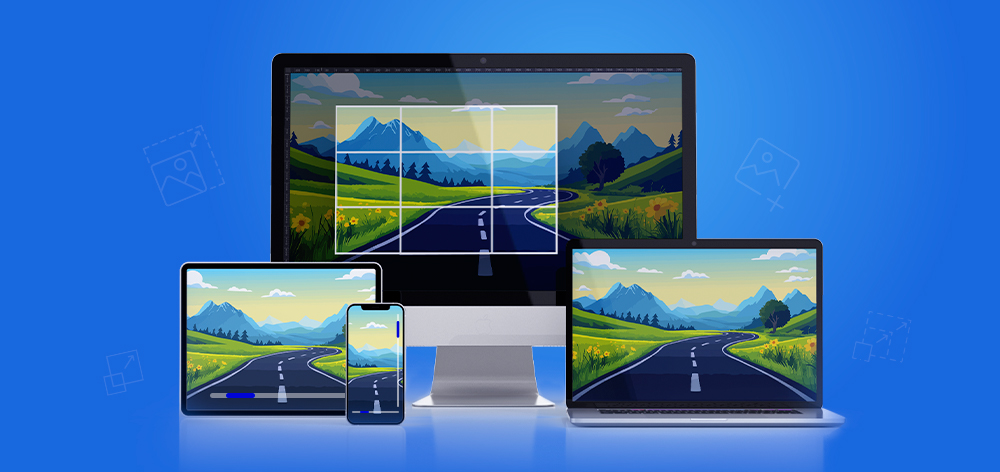
Responsive Bilder helfen dabei, schnelle und optimierte TYPO3-Websites auf Desktop-, Tablet und Mobilgeräten bereitzustellen. TYPO3 bietet mehrere Möglichkeiten, responsive Bilder mithilfe von Core-Funktionen, Fluid ViewHelpers, TypoScript und Extensions zu implementieren.
In diesem Leitfaden untersuchen wir mehr als 10 Möglichkeiten, responsive Bilder in TYPO3 zu erstellen, unter Verwendung von Techniken wie srcset, <picture> Tags und verzögertem Laden, um Bilder bereitzustellen, die sich an unterschiedliche Bildschirmgrößen anpassen.
Responsive Bilder:
TYPO3 verwaltet Bilder über seine File Abstraction Layer (FAL) und unterstützt Backend-Zuschneiden, automatische Bildverarbeitung sowie Rendering mit <f:image> und <f:media>, während gleichzeitig weitere Anpassungen über TypoScript und Extensions ermöglicht werden.
TYPO3 enthält eine leistungsstarke integrierte Bildverwaltung, aber einige Projekte erfordern mehr Kontrolle darüber, wie Bilder generiert, optimiert und auf verschiedenen Geräten bereitgestellt werden.
srcset oder <picture> Einstellungen vermissen lassenBenutzerdefinierte Implementierungen sind nützlich, wenn Projekte Folgendes erfordern:
TYPO3 unterstützt mehrere Ansätze, abhängig vom benötigten Anpassungsgrad.
| Methodentyp | Am besten geeignet für | Hauptmerkmale | Komplexität |
| Kernmethoden von TYPO3 | Standard-Websites | Verwendet <f:image> / <f:media>, Zuschneiden, Lazy Loading | Niedrig |
| Auf TypoScript basierende Methoden | Integrator-Anpassungen | Konfiguration von srcset, sizes, Breakpoints | Mittel |
| Extension-basierte Methoden | Fortgeschrittene Setups | Extensions wie vhs oder sms_responsive_images | Mittel |
| Individuelle PHP-Verarbeitung | Komplexe Projekte | Benutzerdefinierte Bildprozessoren und vollständige Kontrolle über das Rendering | Hoch |
Diese Übersicht hilft Entwicklern und Integratoren, schnell den am besten geeigneten Ansatz für responsive Bilder in TYPO3-Projekten auszuwählen.
TYPO3 bietet mehrere Ansätze zur Implementierung von responsive Bildern, abhängig von den Anforderungen Ihres Projekts. Von Core Fluid ViewHelpers und TypoScript-Konfigurationen bis hin zu Drittanbieter-Extensions und benutzerdefinierter PHP-Verarbeitung können Entwickler und Integratoren die Methode wählen, die am besten zu ihrem Workflow und ihren Performance-Zielen passt.
In den folgenden Abschnitten stellen wir 12 praktische Möglichkeiten vor, um responsive Bilder in TYPO3-Projekten zu erstellen.
<f:media />Eine der einfachsten Möglichkeiten, Bilder in TYPO3 darzustellen, ist die Verwendung des Kern-Fluid-ViewHelpers <f:media />. Er übernimmt automatisch das Rendering von Bildern über TYPO3s File Abstraction Layer (FAL) und unterstützt gängige Attribute wie Breite, Höhe, Alt-Text und Lazy Loading.
Diese Methode wird häufig in TYPO3 Templates verwendet und funktioniert nahtlos mit EXT:fluid_styled_content, was sie zu einem zuverlässigen Standardansatz für die Anzeige von Bildern macht.
Beispiel: TYPO3-Kernimplementierung
<!-- TYPO3 core example -->typo3/sysext/fluid_styled_content/Resources/Private/Partials/Media/Rendering/Image.html<!-- Syntax of <f:media /> --><html xmlns:f="http://typo3.org/ns/TYPO3/CMS/Fluid/ViewHelpers" data-namespace-typo3-fluid="true"><f:mediaclass="image-embed-item"file="{file}"width="{dimensions.width}"height="{dimensions.height}"alt="{file.alternative}"title="{file.title}"loading="{settings.media.lazyLoading}"/></html>
Output-Beispiel
<img class="image-embed-item"title="Title Text"alt="Alt Text"src="/fileadmin/_processed_/6/e/csm_image_02_38sd8s8776.jpg"loading="lazy"width="600"height="337">
Tipps
{settings.media.lazyLoading}EXT:fluid_styled_content templates überschreiben, um das Bild-Rendering anzupassen.styles {templates {layoutRootPath = EXT:yourtemplate/Resources/Private/Layouts/ContentElements/partialRootPath = EXT:yourtemplate/Resources/Private/Partials/ContentElements/templateRootPath = EXT:yourtemplate/Resources/Private/Templates/ContentElements/}}
<img srcset> AttributsEine weitere gängige Möglichkeit, responsive Bilder in TYPO3 zu implementieren, ist die Verwendung des srcset Attributs innerhalb des <img> Tags. Dadurch kann der Browser die am besten geeignete Bildgröße basierend auf der Bildschirmbreite und der Auflösung des Geräts auswählen.
In TYPO3 Fluid-Templates kann das srcset-Attribut über additionalAttributes hinzugefügt werden, während die Bild-URLs mit dem <f:uri.image> ViewHelper erzeugt werden.
Beispiel: Verwendung von srcset mit <f:media>
<!-- Syntax of srcset using additionalAttributes -→<f:mediaclass="image-embed-item"file="{file}"width="{dimensions.width}"height="{dimensions.height}"alt="{file.alternative}"title="{file.title}"loading="{settings.media.lazyLoading}"additionalAttributes="{srcset: '{f:uri.image(image: file, maxWidth: 768)} 768w,{f:uri.image(image: file, maxWidth: 990)} 990w,{f:uri.image(image: file, maxWidth: 1200)} 1200w,{f:uri.image(image: file, maxWidth: 1440)} 1440w,{f:uri.image(image: file, maxWidth: 1900)} 1900w',sizes: '(min-width: 1200px) 50vw, 100vw'}"/>
Output-Beispiel
<imgsrcset="/fileadmin/_processed_/6/e/csm_image_01_8159d1e3b0.jpg 768w,/fileadmin/_processed_/6/e/csm_image_01_19d1039365.jpg 990w,/fileadmin/_processed_/6/e/csm_image_01_9cee8957cf.jpg 1200w,/fileadmin/_processed_/6/e/csm_image_01_922756210c.jpg 1440w,/fileadmin/_processed_/6/e/csm_image_01_0e137c815f.jpg 1900w"sizes="(min-width: 1200px) 50vw, 100vw"class="image-embed-item"title="Title Text"alt="Alt Text"src="/fileadmin/_processed_/6/e/csm_image_02_38sd8s8776.jpg"loading="lazy"width="600"height="337">
Tipps
srcset Attribut hilft Browsern, die optimale Bildgröße für verschiedene Geräte zu laden.styles.content.textmedia.maxWstyles.content.textmedia.maxWInText
<img data-srcset>-AttributsEinige TYPO3-Integratoren bevorzugen die Verwendung von data-srcset anstelle von srcset, insbesondere beim Einsatz von Lazy Loading mit JavaScript-Bibliotheken wie LazySizes. Bei diesem Ansatz werden Bildquellen in data-*-Attributen gespeichert und erst geladen, wenn das Bild in den sichtbaren Bereich (Viewport) gelangt.
Diese Methode hilft, das Laden von Bildern zu verzögern und verbessert die anfängliche Seitenladegeschwindigkeit.
Beispiel: Verwendung von data-srcset für Lazy Loading
<imgclass="image-embed-item lazy"data-src="{f:uri.image(image: file, treatIdAsReference: 1, maxWidth: 1168)}"data-srcset="{f:uri.image(image: file, treatIdAsReference: 1, maxWidth: 768)} 768w,{f:uri.image(image: file, treatIdAsReference: 1, maxWidth: 990)} 990w,{f:uri.image(image: file, treatIdAsReference: 1, maxWidth: 1200)} 1200w,{f:uri.image(image: file, treatIdAsReference: 1, maxWidth: 1440)} 1440w,{f:uri.image(image: file, treatIdAsReference: 1, maxWidth: 1900)} 1900w"data-sizes="(min-width: 1200px) 1168px, 100vw"alt="{file.alternative}"title="{file.title}"width="{dimensions.width}"height="{dimensions.height}"/>
Tipps
data-srcset wird häufig in Kombination mit Lazy-Loading-Bibliotheken verwendet.<f:uri.image> ViewHelper erzeugt automatisch verarbeitete Bildversionen.<picture> TagsDas HTML <picture>-Element ist eine weitere effektive Methode, um responsive Bilder in TYPO3 zu implementieren. Es ermöglicht Entwickler:innen, mehrere Bildquellen für unterschiedliche Bildschirmgrößen oder Bedingungen zu definieren, während der Browser automatisch die am besten geeignete Quelle auswählt.
Dieser Ansatz ermöglicht eine bessere Kontrolle über Haltepunkte, Bildformate und das responsive Verhalten.
Beispiel: Verwendung von <picture> für responsive Bilder
<picture><sourcemedia="(min-width: 990px)"srcset="{f:uri.image(image: file, maxWidth: 1200)}"/><source srcset="{f:uri.image(image: file, maxWidth: 768)}" /><img src="{f:uri.image(image: file, maxWidth: 768)}" alt="{file.alternative}" /></picture>
Tipps
<img>-Element dient als Ausweichlösung für Browser, die <picture> nicht unterstützen.In einigen TYPO3-Implementierungen können responsive Bilder auch direkt über TypoScript-Konfiguration erzeugt werden. Dieser Ansatz ermöglicht Integratoren, mehrere Bildquellen und responsive Breakpoints mit sourceCollection zu definieren.
Obwohl heutzutage oft neuere Ansätze wie DataProcessors bevorzugt werden, ist das TypoScript-basierte Rendering in bestimmten Szenarien weiterhin nützlich.
Beispiel: Verwendung von TypoScript sourceCollection
10 = IMAGE10 {file = fileadmin/sample.jpgfile.width = 3141layoutKey = defaultlayout {srcset {element = <img src="###SRC###" srcset="###SOURCECOLLECTION###" ###PARAMS### ###ALTPARAMS### ###SELFCLOSINGTAGSLASH###>source = |*|###SRC### ###SRCSETCANDIDATE###,|*|###SRC### ###SRCSETCANDIDATE###}}sourceCollection {small {width = 800srcsetCandidate = 800wmediaQuery = (min-device-width: 800px)dataKey = small}}}20 < 1020.layoutKey = srcset
Tipps
renderObjEine weitere Möglichkeit, responsive Bilder in TYPO3 zu implementieren, ist die Verwendung von TypoScript mit renderObj. Dieser Ansatz erlaubt es Entwickler:innen, ein wiederverwendbares TypoScript-Objekt für das Bild-Rendering zu erstellen und es dann dynamisch innerhalb von Fluid-Templates aufzurufen.
Durch die Definition eines benutzerdefinierten TypoScript-Objekts können Sie Bildquellen, Breakpoints und das Rendering-Verhalten zentral steuern.
Beispiel: TypoScript-Objekt für responsive Bilder vorbereiten
lib.objResponsiveImage {default = IMAGEdefault {file {import.current = 1treatIdAsReference = 1}altText.field = alternativetitleText.field = titleparams = class="image-embed-item"layoutKey = srcsetlayout {srcset {element = <img src="###SRC###" srcset="###SOURCECOLLECTION###" sizes="100vw" ###PARAMS### ###ALTPARAMS### ###SELFCLOSINGTAGSLASH###>source = |*|###SRC### ###SRCSETCANDIDATE###,|*|###SRC### ###SRCSETCANDIDATE###}sourceCollection {mobile {maxW = 314srcsetCandidate = 314wdataKey = mobile}}}}}
Objekt über renderObj zuweisen
renderObj < lib.objResponsiveImage.defaultrenderObj {sourceCollection {tablet {width = 768srcsetCandidate = 768wmediaQuery = (max-device-width: 768px)dataKey = tablet}}}
In TYPO3 Fluid rendern
<f:cObjecttyposcriptObjectPath="lib.objResponsiveImage.default"data="{file.uid}"/>
Tipps
<f:cObject> integriert werden.cropVariants in TCEFORMTYPO3 ermöglicht Entwickler:innen, benutzerdefinierte Crop-Varianten für Bilder zu definieren, wodurch Redakteur:innen mehr Flexibilität bei der Vorbereitung von Bildern für unterschiedliche Layouts wie Mobil, Tablet oder Karten erhalten. Mit der TCEFORM-Konfiguration können mehrere Crop-Presets erstellt werden, die Redakteur:innen direkt im TYPO3 backend auswählen können.
Dies hilft, konsistente Bildverhältnisse über responsive Layouts hinweg beizubehalten.
Beispiel: Crop-Varianten in TCEFORM definieren
TCEFORM {sys_file_reference.crop.config.cropVariants {default {title = Alle (Standard)selectedRatio = NaNallowedAspectRatios {NaN {title = Freivalue = 0.0}4:3 {title = 4:3value = 1.333333}}}card {title = CardselectedRatio = 16:9allowedAspectRatios {16:9 {title = 16:9value = 1.777777778}}}}}
Crop-Variante in TYPO3 Fluid rendern
<imgclass="lazy"data-src="{f:uri.image(src: file, treatIdAsReference: 1, maxWidth: 768, cropVariant: 'card')}"data-srcset="{f:uri.image(src: file, treatIdAsReference: 1, maxWidth: 768, cropVariant: 'card')} 768w,{f:uri.image(src: file, treatIdAsReference: 1, maxWidth: 1900, cropVariant: 'card')} 1200"data-sizes="..."alt="..."/>
Tipps
srcset, Lazy Loading und anderen responsive Rendering-Methoden.Die Extension EXT:vhs ist eine beliebte TYPO3-Fluid-Extension, die zusätzliche ViewHelpers für die fortgeschrittene Template-Entwicklung bereitstellt. Sie erweitert die Fluid-Funktionalitäten von TYPO3 und bietet bequeme Helfer für die Medienverarbeitung, einschließlich responsive Bilder.
Mit dem <v:media.image> ViewHelper können Entwickler:innen problemlos mehrere Bildgrößen über das srcset-Attribut definieren.
Beispiel: Verwendung von EXT:vhs für responsive Bilder
<v:media.imagesrc="path/to/media.jpg"width="123"height="123"treatIdAsReference="1"srcset="314, 768, 990, 1200"srcsetDefault="768"/>
Tipps
srcset.Die Extension EXT:sms_responsive_images ist eine weit verbreitete TYPO3 Extension, die die Erstellung von responsive Bildern vereinfacht. Sie stellt benutzerdefinierte ViewHelpers bereit, die responsives Bild-Markup basierend auf TYPO3s Bild-Cropping- und Verarbeitungsfunktionen erzeugen.
Mit dieser Extension können Entwickler Bildgrößen, Breakpoints und das Lazy-Loading-Verhalten direkt in Fluid-Vorlagen festlegen.
Beispiel: Verwendung von EXT:sms_responsive_images
<sms:image image="{image}" srcset="400, 600, 800, 1000" /><sms:image image="{image}" srcset="1x, 2x" /><sms:imageimage="{image}"sizes="(min-width: 1200px) 600px, (min-width: 900px) 800px, 100vw"/><sms:imageimage="{image}"breakpoints="{0: {'cropVariant': 'desktop', 'media': '(min-width: 1000px)', 'srcset': '1000, 1200, 1400, 1600'},1: {'cropVariant': 'mobile', 'srcset': '400, 600, 800, 1000, 1200, 1400, 1600'}}"/><sms:image image="{image}" srcset="400, 600" lazyload="true" />
Tipps
Die Extension EXT:fluid_styled_responsive_images erweitert TYPO3s fluid_styled_content, um die Unterstützung für responsive Bilder zu bieten. Sie ermöglicht Entwickler:innen, responsive Bildquellen über TypoScript sourceCollection zu konfigurieren, was die Definition unterschiedlicher Bildgrößen für verschiedene Bildschirmbreiten erleichtert.
Dieser Ansatz integriert sich direkt in TYPO3s Standard-Content-Elemente und fügt gleichzeitig Unterstützung für responsive Bilder hinzu.
Beispiel: Responsive Bilder mit TypoScript konfigurieren
tt_content.textmedia {settings {responsive_image_rendering {layoutKey = srcsetsourceCollection {10 {dataKey = desktopwidth = 1260msrcset = 1260w}20 {dataKey = tabletwidth = 960msrcset = 960w}}}}}
Tipps
sourceCollection zur Definition von Breakpoints.EXT:responsive-images ist eine weitere TYPO3-Extension, die responsive Bildunterstützung für Fluid-Templates hinzufügt. Sie arbeitet zusammen mit TYPO3s MediaViewHelper und ermöglicht Integratoren, Bildvarianten, Breakpoints und Bildqualitäts-Einstellungen zu definieren.
Die Extension berücksichtigt auch TYPO3-Crop-Varianten und kann unterschiedliche Bildqualitäten für verschiedene Bildschirmgrößen generieren.
Beispiel: Verwendung von EXT:responsive-images
<r:loadRegister key="IMAGE_VARIANT_KEY" value="default"><f:media file="{file}" /></r:loadRegister>
Beispiel für Responsive Rendering
<picture><source media="(max-width: 40em)" srcset="320x180-q65.jpg 1x, 640x360-q40.jpg 2x" /><source media="(min-width: 64.0625em)" srcset="1920x1080-q80.jpg 1x" /><source media="(min-width: 40.0625em)" srcset="1024x576-q80.jpg 1x, 2048x1152-q40.jpg 2x" /><img src="1920x1080.jpg" alt="Example alternative" width="1920" height="1080" /></picture>
Tipps
Bei anspruchsvollen TYPO3-Projekten können Entwickler responsive Bilder mithilfe eines benutzerdefinierten DataProcessors implementieren, der auf der ImageProcessorCore-API von TYPO3 basieren. Dieser Ansatz ermöglicht die vollständige Kontrolle darüber, wie Bilder verarbeitet, in der Größe angepasst und auf verschiedenen Bildschirmgrößen dargestellt werden.
Durch die Erweiterung des Core-ImageProcessors können Entwickler:innen Bildmaße dynamisch berechnen, responsive Breakpoints definieren und optimierte Formate wie WebP und JPEG ausgeben.
Beispiel: benutzerdefinierter ImageProcessor (PHP)
<?phpdeclare(strict_types=1);namespace YourVendor\YourTemplate\DataProcessing;use TYPO3\CMS\Frontend\ContentObject\ContentObjectRenderer;use TYPO3\CMS\Frontend\DataProcessing\ImageProcessor as ImageProcessorCore;class ImageProcessor extends ImageProcessorCore{protected $maxWidths = ['full' => 1600,'beside' => 800];public function process(ContentObjectRenderer $cObj,array $contentObjectConfiguration,array $processorConfiguration,array $processedData) {$processedData = parent::process($cObj, $contentObjectConfiguration, $processorConfiguration, $processedData);return $processedData;}}
Beispiel für Responsive Rendering (Fluid Template)
<picture><f:if condition="{dimensions.maxWidth} > 1201"><source srcset="{f:uri.image(image:file, maxWidth: 1601, fileExtension: 'webp')}" type="image/webp"><source srcset="{f:uri.image(image:file, maxWidth: 1600, fileExtension: 'jpg')}" type="image/jpeg"></f:if><f:if condition="{dimensions.maxWidth} > 769"><source srcset="{f:uri.image(image:file, maxWidth: 1201, fileExtension: 'webp')}" type="image/webp"><source srcset="{f:uri.image(image:file, maxWidth: 1200, fileExtension: 'jpg')}" type="image/jpeg"></f:if><imgclass="image-embed-item"title="{file.title}"alt="{file.description -> f:format.nl2br()}"src="{f:uri.image(image:file, maxWidth: 1600)}"width="{dimensions.width}"height="{dimensions.height}"loading="{settings.media.lazyLoading}" /></picture>
Den benutzerdefinierten Datenprozessor zuweisen
tt_content.textmedia.dataProcessing {20 = YourVendor\YourTemplate\DataProcessing\ImageProcessor}
Tipps

Die beste Methode hängt davon ab, wer die Lösung implementiert und welches Maß an Kontrolle in einem TYPO3-Projekt erforderlich ist.
Entwickler benötigen in der Regel maximale Flexibilität und Kontrolle über die Performance.
<picture> und erweiterte srcsetIntegrator:innen konfigurieren responsive Bilder normalerweise über Fluid-Templates und TypoScript.
<f:media> oder <f:image>srcset und GrößensourceCollectionRedakteur:innen profitieren von einfachen Backend-Bildwerkzeugen.

Responsive Images verbessern die Geschwindigkeit der Website, die mobile Benutzerfreundlichkeit und die SEO-Performance, indem optimierte Bilder für verschiedene Geräte bereitgestellt werden.
srcset und sizesWebP ist ein modernes Bildformat, das kleinere Dateigrößen bei guter visueller Qualität liefert und so die Performance von TYPO3 Website verbessert.
Seit TYPO3 v10.3 können WebP-Bilder mit Fluid ViewHelpers wie <f:image>, <f:media> und <f:uri.image> generiert werden.
<picture><source srcset="{f:uri.image(image: file, treatIdAsReference: true, fileExtension: 'webp')}" type="image/webp"/><source srcset="{f:uri.image(image: file, treatIdAsReference: true, fileExtension: 'jpg')}" type="image/jpeg"/><f:image alt="{file.alternative}" image="{file}" treatIdAsReference="true"/></picture>
Browser, die WebP unterstützen, laden das optimierte Bild, während andere auf JPEG zurückfallen.
TYPO3 nutzt ImageMagick oder GraphicsMagick für die Bildverarbeitung
Aktivieren Sie WebP-Uploads, indem Sie die Erweiterung in der TYPO3-Konfiguration zulassen:
$GLOBALS['TYPO3_CONF_VARS']['GFX']['imagefile_ext'] = 'gif,jpg,jpeg,tif,tiff,bmp,pcx,tga,png,pdf,ai,svg,webp';
Selbst bei den integrierten TYPO3-Tools können falsche Konfigurationen die Performance verringern.
sizes-Attribut(min-width: 1200px) 50vw, 100vwErstellung von Responsive Images in TYPO3 mit T3AI Die Erstellung von responsive Images in TYPO3 kann manchmal mehrere Konfigurationsschritte erfordern. Mit der T3AI TYPO3 AI Extension wird dieser Prozess deutlich schneller und einfacher.
Wird von fortschrittlichen KI-Modellen unterstützt und hilft, optimierte sowie responsive Bilder automatisch in TYPO3 zu generieren Ermöglicht Entwicklern und Redakteur:innen, hochwertige Bilder für verschiedene Geräte ohne komplexe manuelle Einrichtung zu erstellen
Mit KI-gestützter Bildoptimierung können TYPO3-Projekte eine hohe Performance und konsistente visuelle Qualität über alle Geräte hinweg gewährleisten.
Die Implementierung responsiver Bilder ist für die Bereitstellung schneller, moderner und gerätefreundlicher TYPO3-Websites unerlässlich. Dank des flexiblen Ökosystems von TYPO3 stehen Entwicklern und Integratoren zahlreiche Optionen zur Verfügung, von zentralen Fluid-ViewHelpern und TypoScript-Konfigurationen bis hin zu Erweiterungen und benutzerdefinierten PHP-Implementierungen.
Die Wahl der richtigen Methode hängt von Ihren Projektanforderungen, Leistungszielen und dem erforderlichen Grad an Anpassung ab. Durch die Kombination von Techniken für responsive Bilder mit modernen Formaten und Optimierungsverfahren können TYPO3-Websites eine bessere Leistung, ein verbessertes Nutzererlebnis und stärkere SEO-Ergebnisse erzielen.
Entdecken Sie die in diesem Leitfaden vorgestellten Ansätze und wenden Sie die Methode an, die am besten zu Ihrem TYPO3-Projekt passt.
TYPO3 generiert über die FAL-Bildverarbeitung mehrere Bildgrößen, die über srcset, <picture> oder Fluid ViewHelpers bereitgestellt werden können.
TYPO3 unterstützt responsive Rendering über <f:image> und <f:media>, aber srcset wird typischerweise manuell in Templates oder TypoScript konfiguriert.
Die meisten Projekte verwenden <f:media> mit srcset. Für fortgeschrittene Setups können TypoScript, Extensions oder benutzerdefinierte ImageProcessors genutzt werden.
Beliebte Optionen sind EXT:vhs, EXT:sms_responsive_images und EXT:fluid_styled_responsive_images.
Ja. TYPO3 kann WebP-Bilder über Fluid ViewHelpers generieren, sofern ImageMagick WebP unterstützt.
Sie reduzieren die Ladezeit von Seiten, verbessern die mobile Performance und steigern die SEO-Leistung.


Wolfgang Weber
Brand & Communication LeadWolfgang Weber gestaltet TYPO3 mit Leidenschaft und Expertise. Als langjähriger TYPO3-Enthusiast hat er zu zahlreichen Projekten beigetragen, die Websites schneller und sicherer machen. Abseits von TYPO3 findet man ihn…
More From Author