


Claude Code & TYPO3: A Practical Developer Guide
Development
The TYPO3 ecosystem has taken a significant leap forward with the introduction of component-based frontend development in Fluid 4.3. This groundbreaking feature brings modern frontend development patterns directly into the TYPO3 world, offering developers a more maintainable, reusable, and collaborative approach to building web interfaces.
If you've been working with TYPO3's traditional templating system or struggling with the limitations of partials, this guide will walk you through everything you need to know about Fluid Components—from basic concepts to advanced implementation strategies.
This powerful feature is thanks to Simon Praetorius (@s2b), who spent three months bringing modern component-based patterns to TYPO3. His vision, development work, and clear documentation have made it easier for developers to adopt this modern approach. We’re grateful for his contribution to advancing TYPO3 frontend development.

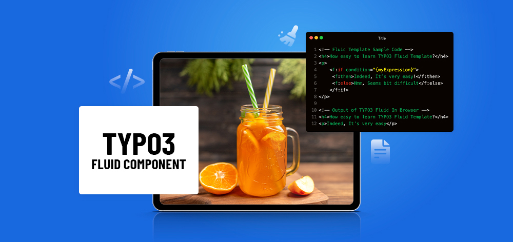
Fluid's components are custom HTML-like tags based on Fluid Templates that you can reuse throughout your project. The concept is similar to popular frontend frameworks like React and Vue or native Web Components, but they are server-rendered by PHP.
Think of components as self-contained, reusable pieces of UI that encapsulate both structure and behavior. Unlike traditional Fluid partials, components offer:

While partials and components might seem similar at first glance, they serve different purposes:
Traditional Partials:
<f:render partial="Button" arguments="{
    variant: 'primary',
    label: 'Click me'
}" />Modern Components:
<my:atom.button variant="primary">
    Click me
</my:atom.button>The component approach is more intuitive, provides better IDE support (planned), and offers stricter type checking.

The web development landscape has shifted dramatically toward component-based architectures. From React and Vue.js to native Web Components, developers expect modular, reusable UI building blocks. Components introduce a modern, component-based workflow that makes your frontend and integration work more modular, consistent and maintainable.
Components transform how teams collaborate on TYPO3 projects:
By encapsulating functionality in discrete components, you get:
Understanding how Fluid Components compare to React can help developers make informed architectural decisions.
| Aspect | React | Fluid Components |
| Component Definition | JSX-based components | Fluid template-based components |
| Props/Arguments | Typed props with PropTypes/TypeScript | Typed arguments with <f:argument> |
| Composition | Component nesting and composition | Component nesting with <f:slot> |
| Reusability | Import and use anywhere | Global availability with namespaces |
Rendering Model:
Data Flow:
Learning Curve:
Choose Fluid Components when:
Consider React when:

You can start using components today in your Composer-based TYPO3 v13 projects by updating to the latest Fluid version. Ensure you have:
First, create a Component Collection class that defines where your components live:
<?php
namespace Vendor\MyPackage\Components;

use TYPO3Fluid\Fluid\Core\Component\AbstractComponentCollection;
use TYPO3Fluid\Fluid\View\TemplatePaths;
use TYPO3\CMS\Core\Utility\ExtensionManagementUtility;

final class ComponentCollection extends AbstractComponentCollection
{
    public function getTemplatePaths(): TemplatePaths
    {
        $templatePaths = new TemplatePaths();
        $templatePaths->setTemplateRootPaths([
            ExtensionManagementUtility::extPath(
                'my_sitepackage',
                'Resources/Private/Components/'
            ),
        ]);
        return $templatePaths;
    }
}Create a folder structure for your components. Following atomic design principles:
Resources/Private/Components/
├── Atom/
│   └── Button/
│       └── Button.html
├── Molecule/
│   └── Card/
│       └── Card.html
└── Organism/
    └── Header/
└── Header.htmlCreate your first button component (Button/Button.html):
<f:argument name="variant" type="string" optional="true" default="primary" />
<f:argument name="size" type="string" optional="true" default="medium" />
<f:argument name="disabled" type="bool" optional="true" default="false" />

<button
    class="btn btn--{variant} btn--{size}"
    {f:if(condition: disabled, then: 'disabled="disabled"')}
>
    <f:slot />
</button>In any Fluid template, import the namespace and use your component:
<html
    xmlns:my="http://typo3.org/ns/Vendor/MyPackage/Components/ComponentCollection"
    data-namespace-typo3-fluid="true"
>

<my:atom.button variant="secondary" size="large">
    Get Started Now
</my:atom.button>

</html>

This renders as:
<button class="btn btn--secondary btn--large">
    Get Started Now
</button>Let's create a more complex component that demonstrates composition and multiple arguments:
<!-- Components/Molecule/Card/Card.html -->
<f:argument name="title" type="string" />
<f:argument name="subtitle" type="string" optional="true" />
<f:argument name="image" type="string" optional="true" />
<f:argument name="link" type="string" optional="true" />
<f:argument name="variant" type="string" optional="true" default="default" />

<article class="card card--{variant}">
    <f:if condition="{image}">
        <div class="card__image">
            <img src="{image}" alt="{title}" />
        </div>
    </f:if>

    <div class="card__content">
        <h3 class="card__title">{title}</h3>
        <f:if condition="{subtitle}">
            <p class="card__subtitle">{subtitle}</p>
        </f:if>

        <div class="card__body">
            <f:slot />
        </div>

        <f:if condition="{link}">
            <div class="card__footer">
                <my:atom.button variant="outline">
                    <a href="{link}">Read More</a>
                </my:atom.button>
            </div>
        </f:if>
    </div>
</article>Usage:
<my:molecule.card
    title="TYPO3 Components"
    subtitle="Modern Frontend Development"
    image="/images/typo3-logo.svg"
    link="/learn-more"
    variant="featured"
>
    Discover how Fluid Components revolutionize TYPO3 frontend development
    with reusable, maintainable UI building blocks.
</my:molecule.card>Create a reusable form input component:
<!-- Components/Atom/Input/Input.html -->
<f:argument name="name" type="string" />
<f:argument name="type" type="string" optional="true" default="text" />
<f:argument name="label" type="string" optional="true" />
<f:argument name="placeholder" type="string" optional="true" />
<f:argument name="required" type="bool" optional="true" default="false" />
<f:argument name="value" type="string" optional="true" />
<f:argument name="error" type="string" optional="true" />

<div class="form-field {f:if(condition: error, then: 'form-field--error')}">
    <f:if condition="{label}">
        <label for="{name}" class="form-field__label">
            {label}
            <f:if condition="{required}">
                <span class="form-field__required">*</span>
            </f:if>
        </label>
    </f:if>

    <input
        type="{type}"
        id="{name}"
        name="{name}"
        placeholder="{placeholder}"
        value="{value}"
        class="form-field__input"
        {f:if(condition: required, then: 'required="required"')}
    />

    <f:if condition="{error}">
        <span class="form-field__error">{error}</span>
    </f:if>
</div>
<!-- Components/Organism/Navigation/Navigation.html -->
<f:argument name="items" type="array" />
<f:argument name="currentPage" type="string" optional="true" />
<nav class="main-navigation">
<ul class="nav-list">
<f:for each="{items}" as="item">
<li class="nav-item {f:if(condition: '{item.url} == {currentPage}', then: 'nav-item--active')}">
<a href="{item.url}" class="nav-link">
{item.title}
</a>
<f:if condition="{item.children}">
<ul class="nav-submenu">
<f:for each="{item.children}" as="child">
<li class="nav-subitem">
<a href="{child.url}" class="nav-sublink">
{child.title}
</a>
</li>
</f:for>
</ul>
</f:if>
</li>
</f:for>
</ul>
</nav>
Organize components following atomic design principles:
Resources/Private/Components/
├── Atom/                    # Basic building blocks
│   ├── Button/
│   ├── Input/
│   ├── Icon/
│   └── Link/
├── Molecule/                # Component combinations
│   ├── Card/
│   ├── SearchBox/
│   └── Breadcrumb/
├── Organism/                # Complex UI sections
│   ├── Header/
│   ├── Footer/
│   └── ProductList/
└── Template/                # Page-level layouts
    ├── Default/
└── Landing/Follow consistent naming patterns:
Design clear, intuitive component APIs:
<!-- Good: Clear, predictable arguments -->
<f:argument name="variant" type="string" optional="true" default="primary" />
<f:argument name="size" type="string" optional="true" default="medium" />
<f:argument name="disabled" type="bool" optional="true" default="false" />

<!-- Avoid: Too many optional arguments without good defaults -->
<f:argument name="buttonStyle" type="string" optional="true" />
<f:argument name="buttonColor" type="string" optional="true" />
<f:argument name="buttonBorder" type="string" optional="true" />Problem: Creating components for every small UI element, even when they're used only once.
Solution: Follow the "Rule of Three"—create a component when you need it in three different places, or when it has complex logic worth encapsulating.
<!-- Avoid: Over-componentizing -->
<my:atom.paragraph text="Simple text" />

<!-- Better: Use direct HTML for simple cases -->
<p>Simple text</p>Problem: Components with unclear or inconsistent argument naming.
Solution: Establish clear conventions and document your component APIs:
<!-- Poor: Unclear naming -->
<f:argument name="btn_type" type="string" />
<f:argument name="isDisable" type="bool" />

<!-- Better: Consistent, clear naming -->
<f:argument name="variant" type="string" />
<f:argument name="disabled" type="bool" />Problem: Creating monolithic components that try to do everything.
Solution: Embrace composition—build complex components from simpler ones:
<!-- Complex card component composed of simpler parts -->
<my:molecule.card>
    <f:slot name="header">
        <my:atom.badge variant="new">New</my:atom.badge>
        <my:atom.heading level="3">{title}</my:atom.heading>
    </f:slot>

    <f:slot name="content">
        <!-- Content here -->
    </f:slot>

    <f:slot name="footer">
        <my:atom.button variant="primary">Action</my:atom.button>
    </f:slot>
</my:molecule.card>Problem: Including business logic or data fetching in presentation components.
Solution: Keep components focused on presentation. Handle data preparation in controllers or ViewHelpers:
<!-- Avoid: Data fetching in components -->
<f:argument name="productId" type="int" />
<!-- Complex data fetching logic here -->

<!-- Better: Pass prepared data -->
<f:argument name="product" type="array" />Problem: Components that break when required arguments are missing.
Solution: Use proper argument definitions with sensible defaults:
<f:argument name="title" type="string" />
<f:argument name="variant" type="string" optional="true" default="default" />

<f:if condition="{title}">
    <h2 class="component-title component-title--{variant}">
        {title}
    </h2>
<f:else>
    <f:debug title="Missing required argument: title" />
</f:if>Sometimes it might be helpful to provide some global settings to all components within one component collection. One common use case could be to provide design tokens from a JSON file to your components.
<?php
namespace Vendor\MyPackage\Components;

use TYPO3Fluid\Fluid\Core\Component\AbstractComponentCollection;

final class ComponentCollection extends AbstractComponentCollection
{
    private ?array $designTokens = null;

    public function getAdditionalVariables(string $viewHelperName): array
    {
        $this->designTokens ??= json_decode(
            file_get_contents('path/to/designTokens.json'),
            true
        );

        return [
            'designTokens' => $this->designTokens,
        ];
    }
}Use design tokens in components:
<f:argument name="color" type="string" optional="true" default="brand" />

<div class="alert" style="
    background-color: {designTokens.colors.{color}};
    border-radius: {designTokens.borderRadius.medium};
    padding: {designTokens.spacing.medium};
">
    <f:slot />
</div>For more complex scenarios, you can implement dynamic component loading:
<!-- Dynamic component based on content type -->
<f:switch expression="{content.type}">
    <f:case value="text">
        <my:molecule.textBlock content="{content}" />
    </f:case>
    <f:case value="image">
        <my:molecule.imageBlock content="{content}" />
    </f:case>
    <f:case value="video">
        <my:molecule.videoBlock content="{content}" />
    </f:case>
    <f:defaultCase>
        <my:molecule.genericBlock content="{content}" />
    </f:defaultCase>
</f:switch>While Fluid Components don't have built-in testing frameworks yet, you can implement testing strategies:
If you want to define an alternative folder structure to the default, you can do so by providing a custom implementation of resolveTemplateName in your ComponentCollection.
<?php
public function resolveTemplateName(string $viewHelperName): string
{
    $fragments = array_map('ucfirst', explode('.', $viewHelperName));
    return implode('/', $fragments);
}This allows flatter structures:
Components/
├── Atom/
│   └── Button.html      # Instead of Button/Button.html
├── Molecule/
│   └── Card.html
└── Organism/
└── Header.htmlMigrating existing partials to components is straightforward:
Before (Partial):
<!-- Partials/Button.html -->
<button class="btn btn--{variant}">
    {label}
</button>

<!-- Usage -->
<f:render partial="Button" arguments="{variant: 'primary', label: 'Click me'}" />After (Component):
<!-- Components/Atom/Button/Button.html -->
<f:argument name="variant" type="string" optional="true" default="primary" />

<button class="btn btn--{variant}">
    <f:slot />
</button>

<!-- Usage -->
<my:atom.button variant="primary">Click me</my:atom.button>The TYPO3 community has exciting plans for Fluid Components:
Join the discussion in #typo3-fluid on Slack, or open an issue on GitHub if you find a bug.
Ways to get involved:
Consider creating and sharing component libraries:
Fluid Components represent a paradigm shift in TYPO3 frontend development, bringing modern component-based patterns to the platform we love. By embracing this new approach, developers can create more maintainable, reusable, and collaborative frontend architectures.
The transition from traditional templating to component-based development isn't just about new syntax—it's about adopting a mindset that prioritizes modularity, reusability, and clear interfaces. Whether you're building simple websites or complex applications, Fluid Components provide the tools and patterns needed for modern frontend development.
Start small, experiment with basic components, and gradually build up your component library. The TYPO3 community is excited to see what you'll create with this powerful new feature. Welcome to the future of TYPO3 frontend development!
Want to dive deeper? Check out the official Fluid Components documentation and join the discussion in the TYPO3 community forums.


Wolfgang Weber
Brand & Communication LeadWolfgang Weber shapes TYPO3 with passion and expertise. As TYPO3 enthusiast, he has contributed to TYPO3 projects that make websites faster and more secure. Outside of TYPO3, you'll probably find him exploring local cafés and…
More From Author